Project Overview
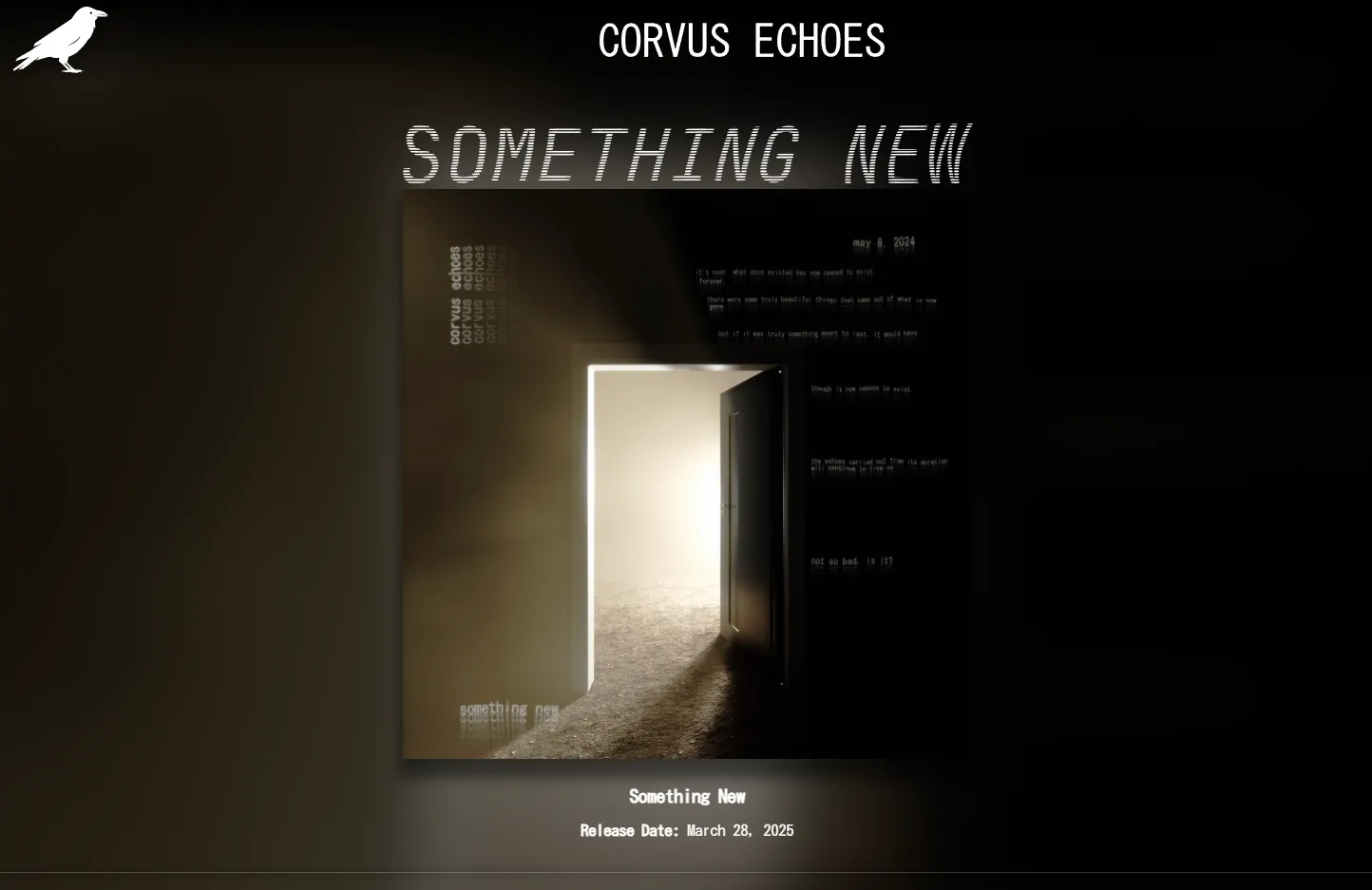
For my album Something New, I designed and developed a custom landing page serving as both a promotional tool and a visual extension of my brand identity as Corvus Echoes. The goal was a site that integrates seamlessly with the album’s aesthetic; a cohesive experience across every touchpoint.
- Type: Album Landing Page
- Role: Designer & Developer (Solo)
- Tools: HTML, CSS, JavaScript
- Live Project: corvus-echoes.com/albums/something-new
Design Approach
Minimalist UI with Strong Branding
Rather than a traditional cluttered landing page, I focused on deliberate simplicity; I kept only essential elements while ensuring each felt meaningful. Every detail, from typography to animation timing, was chosen to reinforce the album’s aesthetic.
Balancing Desktop and Mobile
One of the core design challenges was ensuring the experience translated well across screen sizes.
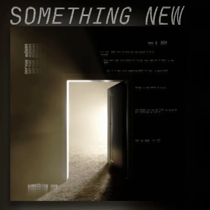
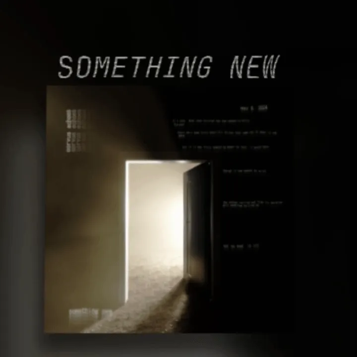
- The album cover is meant to feel in front of everything else, creating a sense of depth and immersion.
- On desktop, this is achieved through a 3D hover effect tied to mouse movement.
- On mobile, a gentle continuous rotation replaces the interaction, maintaining motion without requiring user input.
Development
Navigation and Interactions
- The Corvus Echoes logo in the top-left subtly grows on hover, signaling it as a navigation element back to the main site.
- Layout and structure are intentionally fluid, ensuring users reach key information without friction or distraction.
Performance
The page was kept deliberately lightweight. For a landing page, first impression speed matters as much as visual impact.
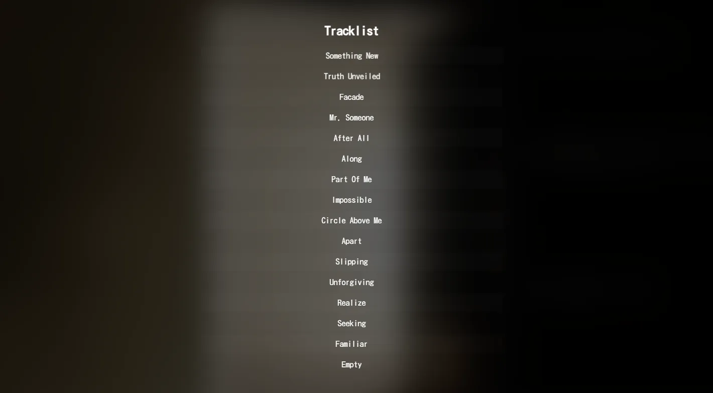
Tracklist Presentation
The tracklist needed to feel interactive while maintaining the atmospheric aesthetic of the rest of the page. A subtle alternating background effect with hover animation visually separates each track without breaking the mood.
Embedded Media
To push the immersion further, I embedded my 3D-animated music video directly on the page. Users can engage with the album’s visual and auditory world without leaving the site.

Reflection
What Worked
- Translating a musical brand identity into an interactive digital space with minimal UI clutter.
- Motion design that adapts meaningfully between desktop and mobile rather than just scaling down.
- The constraint of simplicity pushed every decision to carry more weight.
What’s Next
Given more time, I’d explore audio-reactive visuals, more interactive storytelling elements, and experimental motion graphics. I always enjoy finding ways to push mediums their limits, and landing pages are no exception.